Real-Time Threat Visualization

ThreatAtlas™

Live -- Running Now

Every probe, every surveillance request, every blocked domain -- mapped in real time on a live global display. ThreatAtlas turns the invisible war being fought at your router into something you can actually see.

Most people have no idea how often their home network is being hit. ThreatAtlas shows you -- not as a number buried in a log file, but as animated arcs on a world map, landing on your location, stopped cold.
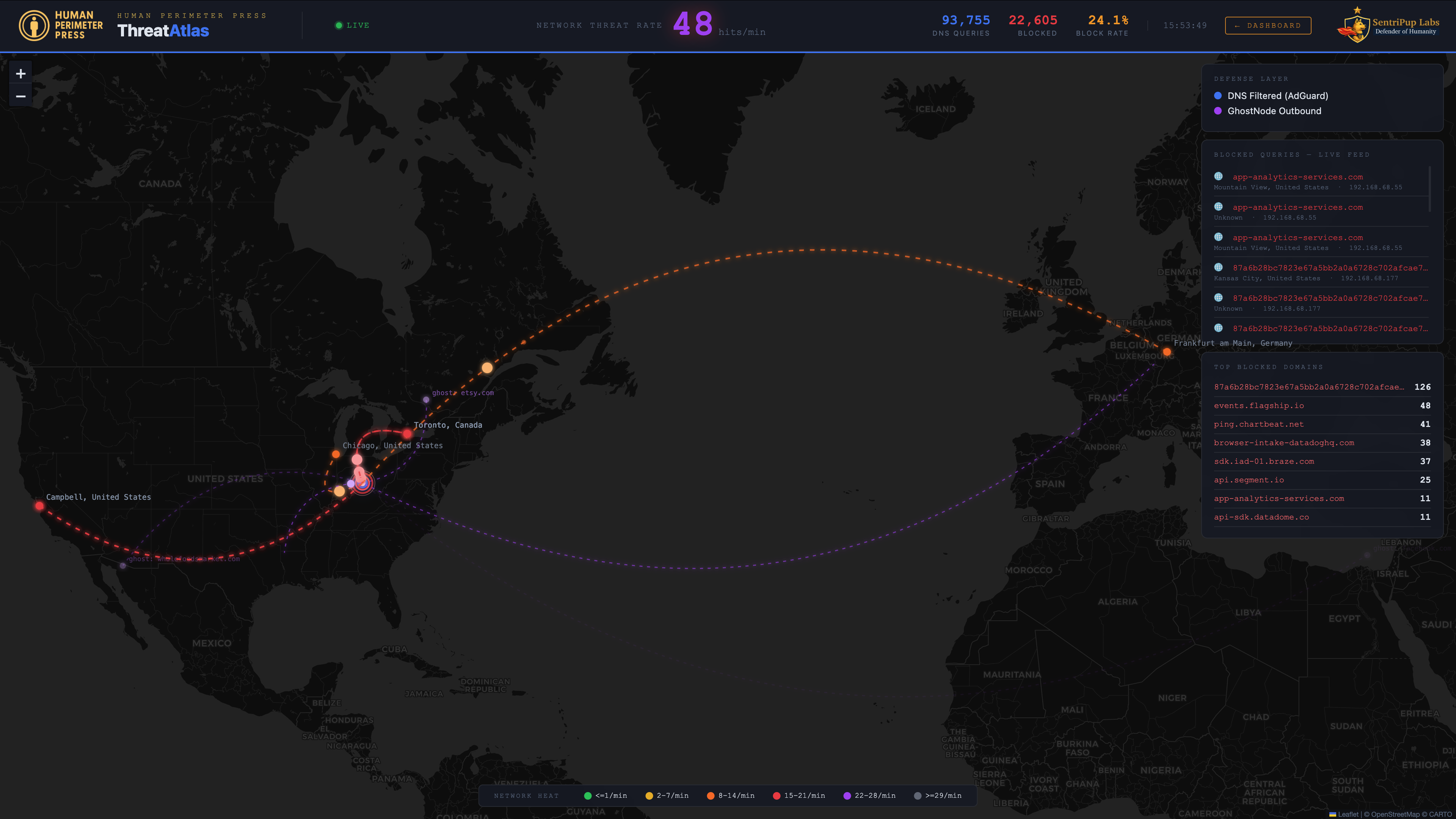
ThreatAtlas live threat map showing DNS missile arcs
92K+
DNS Queries per Day
21K+
Blocked per Day
23%
Average Block Rate
Real Time
Live Feed -- No Delay
What It Does

Intelligence you can actually see.

ThreatAtlas connects to your network's DNS layer and visualizes every blocked request as an animated arc on a live global map -- showing you exactly where probes are originating, how often they're hitting, and what PerimeterGuard is doing about it. No dashboards buried in settings menus. No log files to parse. Just the truth, in real time, on your screen.

🌐
Live Global Map
Animated DNS missile arcs show you exactly where surveillance probes are originating -- country, city, ISP. Watch your home defend itself in real time.
Zero-Delay Feed
Every blocked domain appears in the live feed the moment it's intercepted. No polling delay. No summary reports. The actual traffic, as it happens.
📊
Threat Rate Monitoring
A live hits-per-minute counter shows your current threat rate at a glance. DNS queries, block counts, and block rate percentage -- always visible in the header.
🔥
Network Heat Map
Color-coded heat intensity shows which periods of the day your network is under the most pressure. Quiet nights. Busy mornings. You'll start to see the patterns.
🎯
Top Blocked Domains
A running leaderboard of the domains hitting your network hardest -- ranked by frequency, updated in real time. You'll recognize some of the names. You won't be happy about it.
👻
GhostNode Integration
When GhostNode is active, its outbound noise traffic appears on the map in a distinct color -- so you can watch the confusion campaign running alongside the defense.
How It Works

From your router to the map.

ThreatAtlas sits inside your local network, reading the DNS activity that PerimeterGuard is already processing. No cloud relay. No third-party servers. Your data never leaves your home.

01
DNS Request Intercepted
Every outbound DNS request from every device on your network passes through PerimeterGuard first.
02
Blocked or Allowed
Known surveillance domains, ad networks, and behavioral trackers are blocked at the network level -- before they reach your devices.
03
Geolocated in Real Time
Each blocked domain is resolved to its origin -- country, city, ISP -- and plotted instantly on the live global map.
04
You Watch It Happen
Arcs fly. Probes die. The map tells the story of what your home is defending against, every minute of every day.
Reading the Map

What those arcs mean.

Color-Coded Arcs
DNS Filtered -- Blocked by PerimeterGuard
These are surveillance requests, ad trackers, and behavioral profiling domains intercepted and killed before reaching your devices. Arc color reflects frequency -- green is low activity, yellow and orange are moderate, red means your network is under heavy pressure. Every arc, regardless of color, is a win. The more you see, the more you understand what was happening before you had this running.
Purple Arcs
GhostNode Outbound -- Confusion Traffic
When GhostNode is active, these arcs represent the outbound noise -- fake behavioral signatures being sent into the surveillance economy. Realistic-looking traffic that gives data brokers something to collect and analyze -- and then throw away when they realize it's worthless.
The Pulse Effect
Why Some Dots Pulse
Pulsing dots indicate active or recent high-frequency hits from a single origin -- a domain hammering your network repeatedly. These are the most aggressive probes. The pulse makes them impossible to miss.
The Heat Legend
Network Pressure by Frequency
The color-coded heat legend at the bottom shows threat rate by frequency -- from green (quiet) through orange to red (heavy traffic). Most home networks run hot in the early morning and during prime time hours. You'll see it. And once you see it, you can't unsee it.
See It Live

This is a real home network. Under real attack.

No lab environment. No demo data. This is SentriPup ThreatAtlas running live out of the SentriPup Labs facility in Butler County, Ohio -- that dot on the map is us. What you are watching is one person, reading a news article on his phone. Nothing else. At one point in this recording, that single person reading a single news app is generating over 200 surveillance probes per minute. One guy. One phone. One news app. It doesn't matter much which news app -- the results are similar across all of them. This is what is happening to you right now, whether you can see it or not.

Color-Coded Arcs
Inbound surveillance probes blocked by SentriPup PerimeterGuard. Arc color reflects hit frequency -- green is low, yellow and orange are moderate, red is heavy traffic. Every arc, regardless of color, is a win.
The Heat Legend
Color intensity shows threat frequency -- green is quiet, orange is busy, red is heavy. Most home networks run hot during prime time.
Live Feed
Every blocked domain appears in real time -- country flag, domain name, origin city, and the device IP that tried to reach it.

If the Surveillance Economy is a myth -- why the 200 tracking probes per minute on one person reading one news article? That infrastructure costs billions to build and billions to run. Which means they're making even more billions selling what they take from you. The math doesn't lie. Your privacy is worth a fortune -- to everyone except you.

Ready to see what's hitting your network?

ThreatAtlas is part of the SentriPup HPS™ Alpha suite. Join the early access list and be among the first to run it at home.

Next in the HPS™ Alpha Suite
TrustMap™
Network device intelligence -- know every device, trust nothing by default.
See TrustMap™ →